Over at the Conversable Economist yesterday (March 2), Timothy Taylor, as he does virtually every day, has an excellent post. This one is on various measures of the U.S. poverty rate over time. It’s titled “Winning the ‘War on Poverty’–and Now What?”
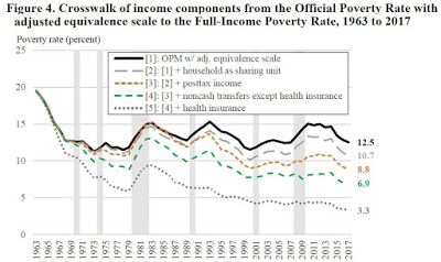
Here’s an amazing graph that he takes from Richard V. Burkhauser, Kevin Corinth, James Ewell, and Jeff Larrimore, “Evaluating the Success of President Johnson’s War on Poverty: Revisiting the Historical Record Using a Full-Income Poverty Measure,” December 2019, IZA DP No. 12855.

As you can see, a more-inclusive–and quite justified–measure of income shows a much lower poverty rate than the official one reported. It’s low single digits versus low double digits. That’s a pretty big difference. (That is, if you can see. The graph is a little hazy, so to see it better, go to Tim’s post referenced above.)
The various adjustments, for size of household, for a better measure of cost of living (the Personal Consumption Expenditures price index instead of the Consumer Price Index), for after-tax income including cash benefits, and for the market value of non-cash benefits, all make sense. And the 3.3 percent poverty above doesn’t yet adjust with the PCE instead of the CPI.
Also, Tim has one of the nicest, most-succinct explanations of why the CPI rather than the PCE is still widely used. Here it is:
But one interesting fact about the CPI is that after it is calculated, it is never revised–not even when the US Bureau of Labor Statistics later makes changes in the technical formulas used to adjust the CPI. Because various contracts and laws depend on the CPI, this lack of adjustment makes some sense. But if you want to know how the poverty rate should have been adjusted over time, it makes sense to use the most current methods for calculating inflation. One prominent measure of buying power that is adjusted over time is called the Personal Consumption Expenditures price index.
I have two critical comments, not of Tim’s post, but of the Burkhauser et al article that he draws on.
First, Burkhauser et al say that in including government medical benefits (presumably that’s largely Medicaid), they are valuing them at market. That’s tricky. To value them at market values, you can’t simply value them at cost. If you give me something that you paid $1.00 for, there’s no assurance that I value it at $1.00. Indeed, in a June 2015 NBER study (#21308), health economists Amy Finkelstein, Nathaniel Hendren, and Erzo F.P. Luttmer estimated that beneficiaries of Medicaid valued $1.00 of spending at only 20 to 40 cents. Burkhauser et al do address the Finkelstein et al point in a footnote. I didn’t totally understand the footnote. But the bottom line is that they seem to be saying they can ignore the Finkelstein et al point. They keep referring to market value of health insurance, even in that footnote, but I do not think that term means what they think it means. They seem to be assuming that the market value = cost. We know that that’s false.
Fortunately, even without their valuation of health insurance, the poverty rate is about 6.9 percent. Notice also their Figure 5 on page 18, where, using the PCE rather than the CPI, they get a poverty rate of only 2.3 percent.
Second, Burkhauser et al conclude that Lyndon Johnson’s War on Poverty worked. They write:
These results demonstrate that even though there remain individuals who are struggling financially based on today’s living standards, President Johnson’s War on Poverty—based on economic standards when he declared that war—is largely over and a success. This observation is apparent using our Full-income Poverty Measure since, unlike previous poverty measures, it is anchored to President Johnson scientifically arbitrary but policy relevant judgment with respect to the poverty population in 1963 and sets its initial thresholds accordingly. It also adjusts these nominal thresholds each year to hold them constant in real terms, and uses a full measure of real income. While this conclusion stands in stark contrast to conventional wisdom (and the poverty rates based on the Official and Supplemental Poverty Measures), it should not be surprising given the substantial resources contributed to transfer programs that are not counted by other poverty measures, as well as the overall economic growth that has occurred since the 1960s.
We need more evidence than the evidence they give. Look at what was happening to the poverty rate in the year or two before the LBJ programs kicked in. It was falling like a rock. Why wouldn’t we assume that continued economic growth would cause it to keep falling? You might say that the prima facie evidence for the War on Poverty’s success is “the substantial resources contributed to transfer programs” that Burkhauser et al highlight in the quote above. But we know that people respond to incentives. The implicit marginal tax rates for people receiving direct welfare, food stamps, housing subsidies, and Medicaid are sometimes 70 percent or more. When they earn income, they can lose 70 cents or more of benefits for every additional dollar they earn past some threshold. So of course many people won’t work to earn money when they can get these transfers and they are heavily penalized, by loss of transfers, for working. If we look at their incomes net of transfers, we are tempted to say that without the transfer programs, their incomes would have been the same as the data show. But that is highly likely to be false. Without those transfer programs, people would have made more income and possibly, in many cases, a great deal more.
READER COMMENTS
Brandon Berg
Mar 4 2020 at 1:04am
My understanding of the footnote:
Finkelstein et al are saying that only 20-40% of Medicaid spending increases health care consumption by beneficiaries, with the other 60-80% going to compensate health care providers for health care that otherwise would have been uncompensated. That is, without Medicaid, beneficiaries still would have gotten most of that health care for free anyway, because hospitals can’t refuse patients requiring emergency care.
Their response is that the value of care received by the poor has nevertheless increased a great deal since 1963, in part because of the 1986 law that made it illegal for hospitals to refuse emergency patients.
Incidentally, some of the people living below the poverty line are not poor in any meaningful sense. I had no income in 2011-12, so I was below the poverty line, but I had over a quarter million dollars in savings, and my material standard of living was totally unaffected. I did not apply for unemployment or other benefits, so I was technically in deep poverty, living very well on less than $2/day in income.
Ideally we should be looking at consumption, rather than income, to determine poverty. In most cases, looking at market income plus transfers and in-kind benefits should provide a good estimate of consumption, but I do wonder how many more people there are out there like me, who have lived quite well in deep poverty.
David Henderson
Mar 4 2020 at 10:32am
You read the footnote the same way I did.
I don’t get how that footnote undercuts the idea that the gain to people on Medicaid is well under $1.00 per dollar of spending. That’s why I said I don’t understand it. I don’t see how their point, which purported to undercut Finkelstein et al’s finding, did so.
Chris
Mar 4 2020 at 1:33am
I have seen research that shows that wealth transfers do not heavily impact income. People do not, by and large, reduce earnings for the possibility of government assistance. This stands to reason, since government assistance is far less reliable and much more restrictive than personal income. Gains in personal income also have a chance of leading to further gains later, which is also something missing in transfers.
Brandon Berg
Mar 4 2020 at 5:10am
One reason the poverty rate couldn’t keep falling at the rate it did was that it would have soon crossed over into negative territory.
Obviously that’s impossible, so it definitely would have had to stop at zero. But is zero really a reasonable lower bound? Some people have disabilities that prevent them from working. Others are unemployed for part of the year, or even all. Some have personality or cognitive problems that make them unemployable.
I think it’s plausible, even likely, that Great Society stopped the decline in the market-income poverty rate. But that doesn’t mean that without it, the poverty rate would have continued falling all the way to zero. There’s probably some lower bound on the percentage of the population that can’t hold down a job, or for some reason just doesn’t do so in a particular year.
David Henderson
Mar 4 2020 at 10:30am
You wrote:
You’re absolutely right. I hope you didn’t get the impression that I was saying something different from this. I wrote, “Why wouldn’t we assume that continued economic growth would cause it to keep falling?” I wasn’t at all implying that it should have continued to fall at the same rate as earlier, precisely for the reason you state.
robc
Mar 4 2020 at 12:25pm
We need more log-linear graphs. Then it could keep falling at the same rate forever without reaching zero.
Obviously the graphs dont have to be log for that to be true, people just need to understand that rates (of this type) work that way.
Thaomas
Mar 5 2020 at 10:30am
But the implication of “Why wouldn’t we assume …” is that public policies to reduce poverty were unwise. If the point was that poverty as better measured could have been reduced more and more quickly with other policies, that’s a different matter.
Matthias Görgens
Mar 5 2020 at 11:42am
Why does Timothy Tyler suggest that a falling poverty rate would force conservatives to admit that government anti-poverty programs have been working?
Wouldn’t the null hypothesis be that economic growths is the underlying cause of improvements? Anything more complicated than that would need careful empirical testing and justification, wouldn’t it?
nobody.really
Mar 5 2020 at 12:26pm
As a general proposition, I expect contributions-in-kind to be less valuable than contributions in cash, unless there are some healthy economies of scale/network economics at work in the in-kind contributions. The classic example is the Christmas present: People might derive more use from a $100 gift card than from a $100 gift. Thus, all else being equal, I would expect the value a person gets from receiving some fringe benefit might be less than the value they would get from receiving a proportionate share of the cash required to provide the benefit.
But often, all else is NOT equal. The tax code may advantage receiving some fringe benefits over receiving the equivalent amount in cash. And health insurers offer better terms for group policies (especially policies tied to employment) than to individuals.
In the case of certain public assistance programs, it can be challenging to identify the beneficiary. Specifically, I argue that the person who benefits from your Medicaid is ME. I, the voter, want you to have healthcare. The fact that you, the recipient, might prefer to receive cash is irrelevant; he who pays the piper calls the tune.
That said, when it comes to measuring the RECIPIENT’s gain from Medicaid, I sense that Henderson gets it right. Thus, I conclude that Henderson makes a persuasive argument that poverty may not have fallen quite as far as the authors believe (though still pretty far!)
Mark Z
Mar 5 2020 at 11:34pm
I’m confused as to how factoring in-kind and cash-transfers into income would help them reach the conclusion that these policies were a success. I would think you’d have to quantify the effect of $X worth of transfers on income to have any idea of whether the transfers succeeded or failed. If you give someone $1000 a year, then observe that their post-transfer annual income went up by $1,000, is that a success? I would concede that there’s a reasonable argument that it was, since it apparently didn’t disincentivize people to work, but what if a $1000 transfer only caused post-transfer income to go up by $500? I’d say it’s reasonable to call that a failure.
Unless they can show how much of an effect a given value of transfers (or really, overall cost, sincere there’s some administrative costs to anti-poverty programs) had on income, then we can’t really tell whether the policy has been a success or failure. “When we gave people money, we found that afterward, they had more money” is not the right standard for ‘success.’ I think, you’d have to show that recipients’ incomes went up by at least as much (or, if we’re charitable, almost as much) as the value of the transfer to have something resembling a clear indicator of success.
Comments are closed.